Project Showcase
Explore the highlights of this project through our curated image gallery, showcasing
the creativity, precision, and attention to detail that defines our work.
Client: Content Craze (UK)
Agency: Vizine
Overview
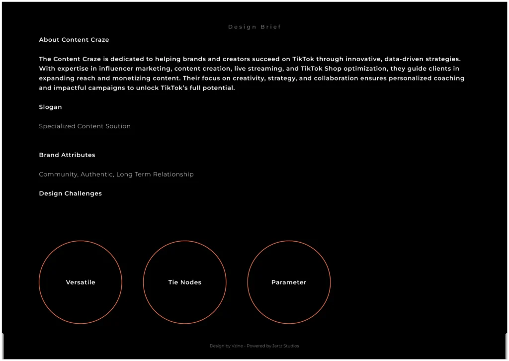
Content Craze is a UK-based TikTok agency dedicated to helping creators grow their presence, engagement, and influence on the platform. With a vibrant, fast-evolving audience and an unconventional brand personality, they required a bold visual identity that could communicate their dynamic essence while maintaining a sense of clarity and professionalism.
Challenge
The existing logo lacked the energy and contemporary appeal necessary for a forward-thinking media agency. The client wanted a refreshed identity something visually engaging, slightly “crazy” in spirit, and reflective of their core service: TikTok content growth. One requirement was the continued use of golden tones in the visual language.
Approach
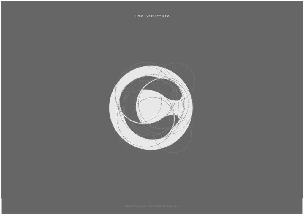
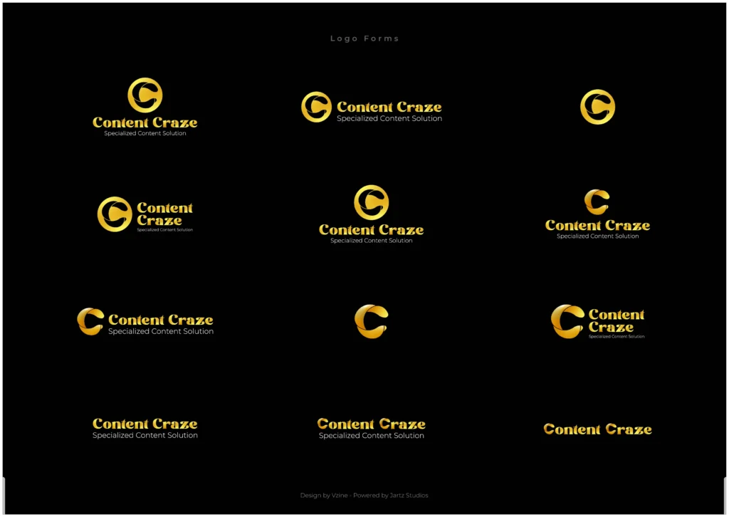
Vizine’s creative direction was guided by the themes of motion, media, and abstract energy. The team explored a range of visual possibilities anchored in minimalism and symbolism. The goal was to develop a mark that could instantly resonate with digital-first audiences while remaining conceptually rich.
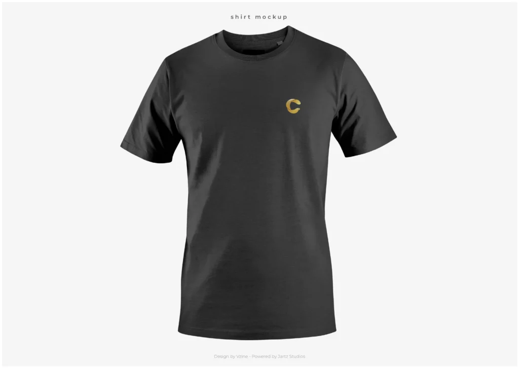
A key concept emerged: a circular form, referencing the letter “C”, integrated with a play icon a universal symbol of video content. Through clever use of negative space and geometric subtraction, the logo subtly presents the play icon within the “C”, creating a visual duality that represents both content and action.
The final symbol introduces a sense of twist and interaction, abstractly referencing gestural forms such as fingers or a hand, reinforcing the human-centric nature of social media and content engagement.
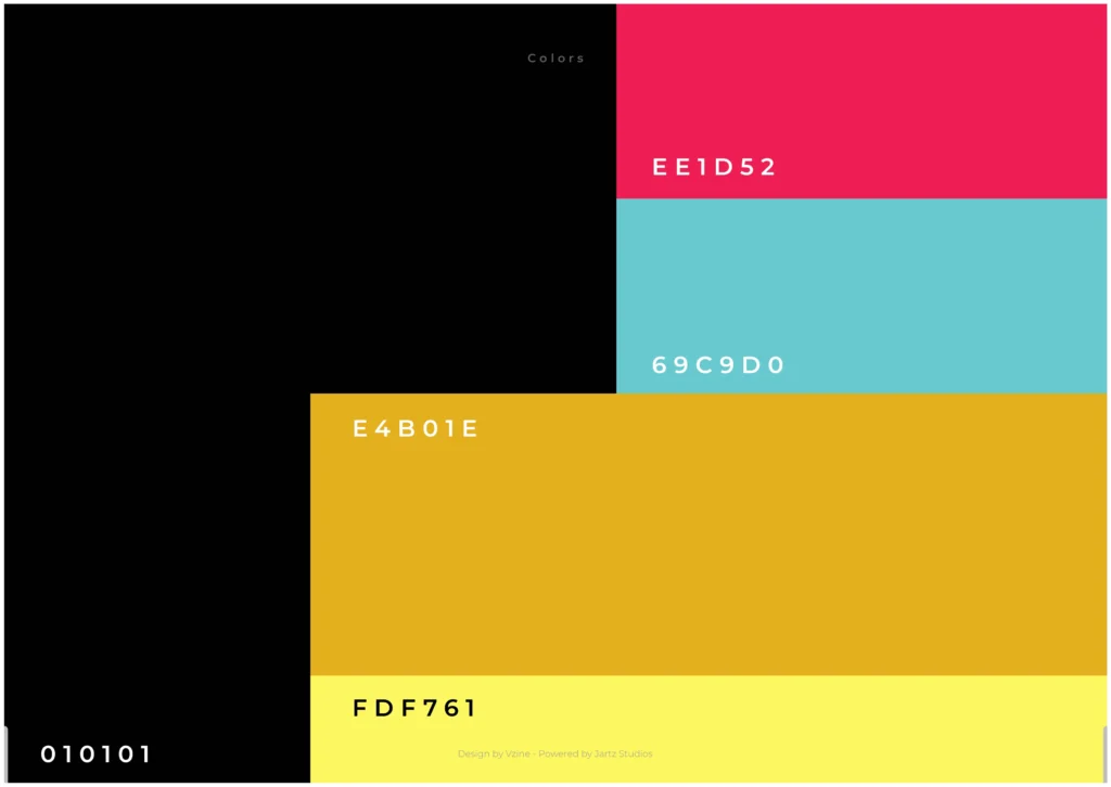
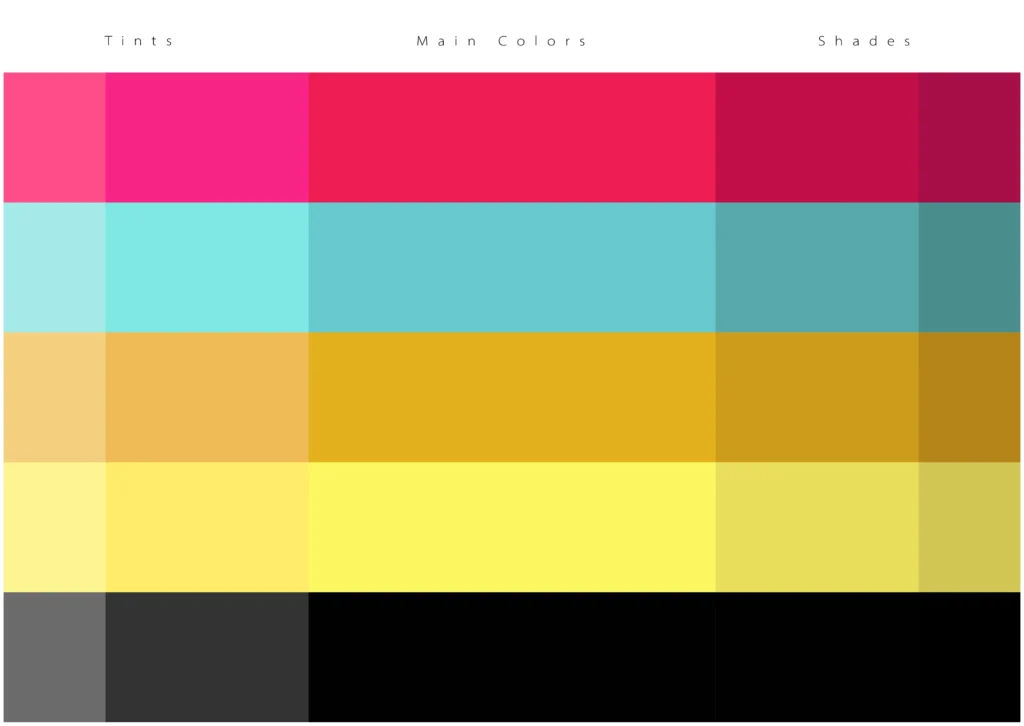
Color Palette
The visual identity centers on a sophisticated gold palette complemented by TikTok-inspired accent tones. The chosen colors include:
Light Gold: #FDF761
Deep Gold: #E4D01E
TikTok Pink: #PE1D52
TikTok Teal: #69E9D0
These tones balance richness and vibrancy, enhancing both digital and print visibility across branded assets.
Solution
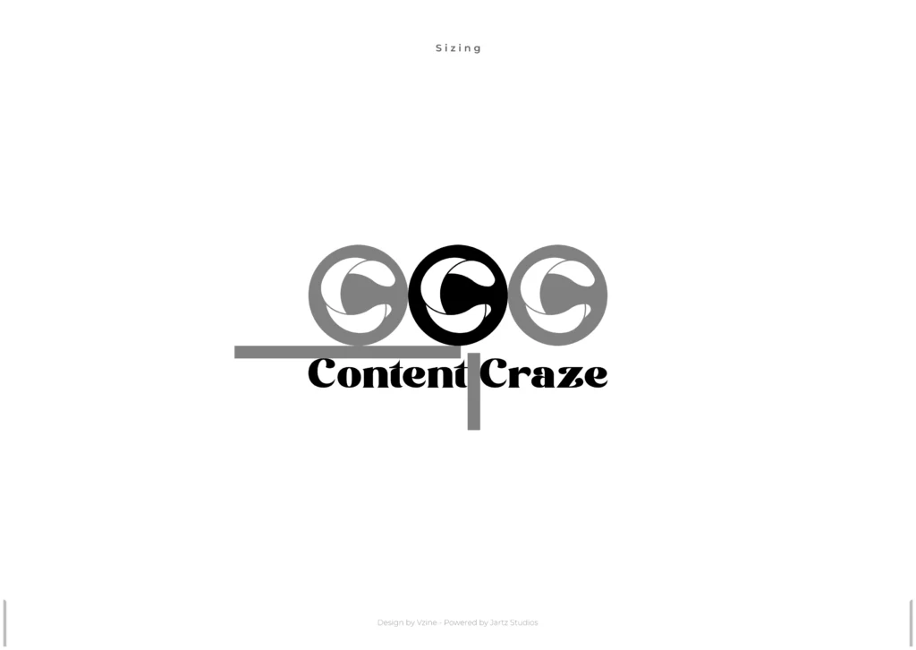
The result is a modular and modern identity system that reflects the brand’s name, personality, and industry relevance. The logo stands out for its minimal yet intelligent construction, while the supporting visuals including color usage, typography, and layout bring cohesion to the overall brand presence.
Deliverables included:
Logo system (primary and secondary variations).
Color and gradient usage guidelines.
Typography (Font Styles and usage guidelines).
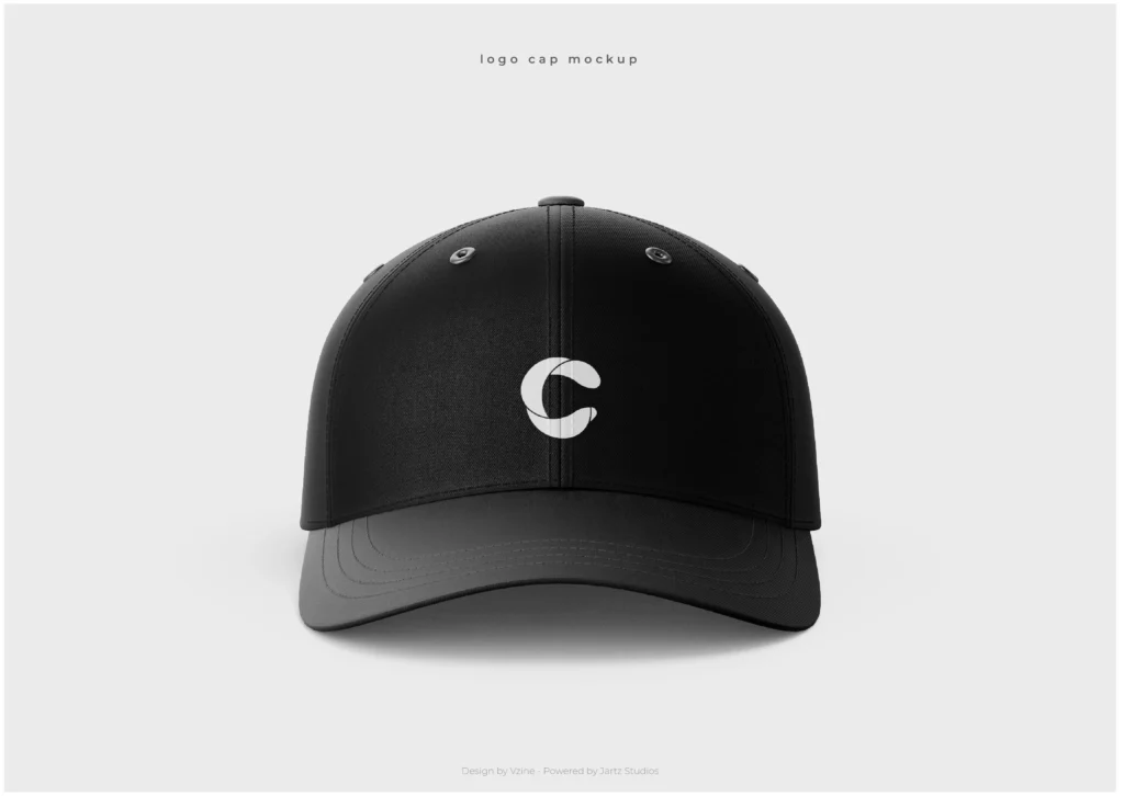
Scalable brand assets for social and digital platforms.
Impact
The new identity successfully positions Content Craze as a forward-looking, creator-focused brand. The logo’s layered meaning and bold form give the agency a distinctive edge, aligning with their commitment to creative growth and digital innovation.
Get the newest insights today
Updates – now available.