
Project Details
Brand Identity Design Process
Explore the highlights of this project through our curated image gallery, showcasing
the creativity, precision, and attention to detail that defines our work.
Client: HBC (Finland)
Agency: Vizine
Stage 1
About the Project
HBC is a European travel and visa consultancy specializing in helping individuals relocate to Finland the world’s happiest country. From educational visa assistance to business visa transitions, HBC guides people at every stage of their journey, offering expert consulting for a smoother life transition abroad.
Stage 2
The Challenge
While HBC had no pressing branding issues, the challenge for the design process was clear: to create a minimalistic, clean, and flat wordmark logo that could translate the strength, authenticity, and guiding spirit of the brand. The identity needed to be simple yet powerful, trustworthy yet vibrant capturing the excitement of new beginnings while maintaining the professionalism expected from a consultancy service.
Stage 3
The Goal
The primary objective was to create a brand image that would build immediate trust with potential clients and evoke feelings of happiness, excitement, and hope. The visual identity needed to position HBC as a reliable, credible guide for those envisioning a future in Europe, particularly Finland.
Stage 4
Creative Direction and Inspiration
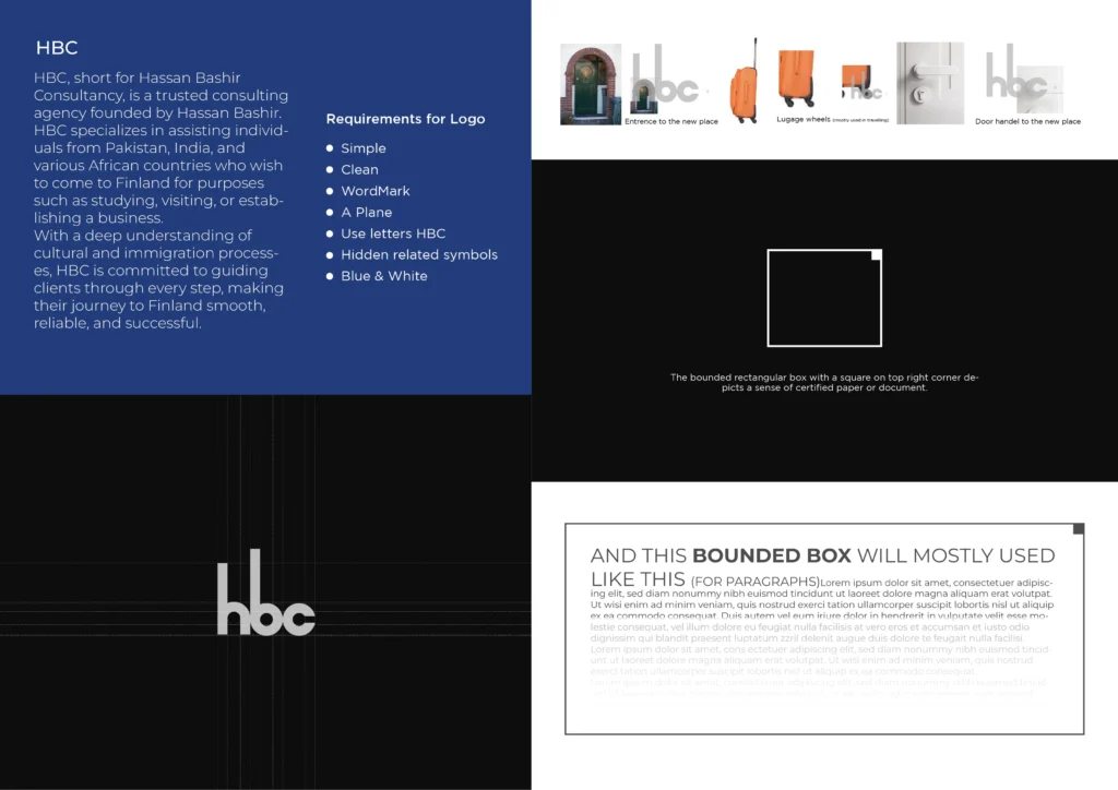
The creative direction for the HBC brand identity was rooted in minimalism and meaningful symbolism. Inspired by the blue of the Finnish flag, the logo centers around a strong wordmark enclosed within a hollow rectangular outline, symbolizing stability, structure, and guidance.
A small, solid blue square sits proudly in the top-right corner inside the hollow rectangle, adding a visual “stamp” of authenticity. This subtle but powerful detail resembles a seal or official document mark, reinforcing the sense of legal credibility and professionalism the consultancy embodies.
The choice of a flat, wordmark-focused approach, combined with simple geometric elements, ensures that the logo remains timeless, versatile, and deeply aligned with HBC’s mission of clarity and support.
Stage 5
Color Palette
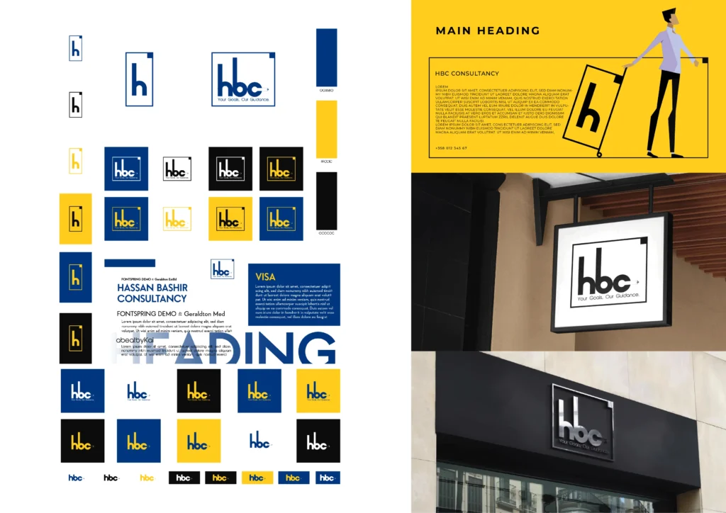
Primary Blue (#003580) – Representing trust, confidence, and the aspirations tied to Finland.
Secondary Yellow (#FFTC1C) – A happy, energetic color to inject positivity and warmth.
Deep Black (#0C0C0C) – Providing a strong contrast and grounding the visuals.
White – Offering clean, fresh spaces and a sense of openness and transpa
Stage 6
Typography
The Montserrat typeface was chosen for its modern, approachable, and professional feel. Utilizing Light, Gold, and Medium variations ensured flexibility across different brand applications while maintaining visual harmony.
Stage 7
The Process
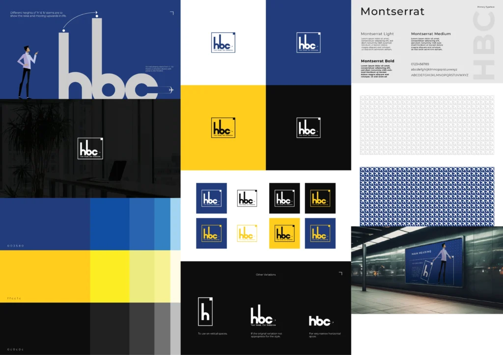
The design process was straightforward yet intentional. Rather than starting with hand sketches, the exploration began directly in Adobe Illustrator, allowing for an organic development of the design through digital composition and refinement.
The focus was on constructing simple shapes and balancing the proportions between the wordmark and the surrounding graphical elements. Several variations were explored, ultimately leading to a primary version along with vertical and horizontal adaptations to ensure flexibility across different mediums.
An additional brand pattern featuring subtle airplane motifs was also developed, intended for use as a background element. This brought an extra layer of visual storytelling, subtly reinforcing the themes of travel, dreams, and movement toward a better life.
Stage 8
Conclusion
The final HBC brand identity captures the spirit of new beginnings with clarity, trust, and happiness at its core. The design reflects a fresh yet professional tone, aligning perfectly with the brand’s mission to guide individuals on their journey toward a brighter future in Europe.